Why I’m Decarbonising My Website (and Why It Matters)
Spent a bit of time over the weekend working on something I’ve wanted to tackle for a while — the carbon impact of my website.
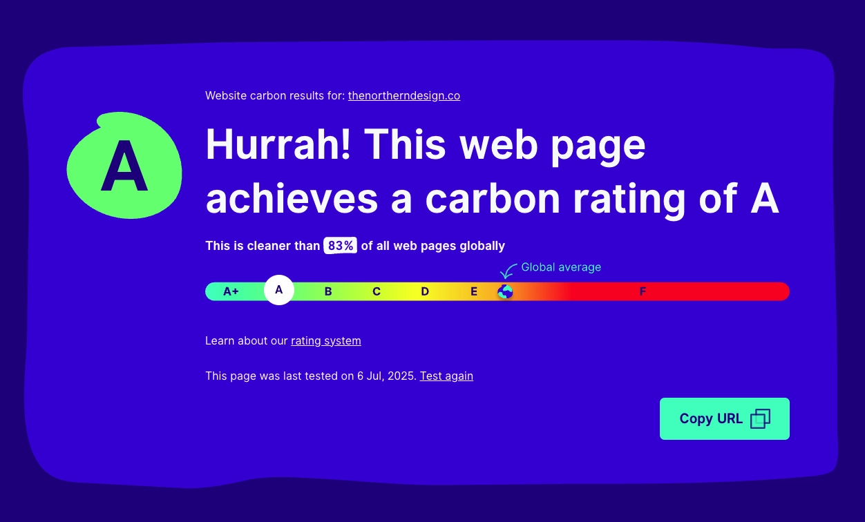
I’d been meaning to run thenortherndesign.co through the Website Carbon Calculator for ages. Finally did it… and got a solid A. Not bad. But now I want that A to be the minimum benchmark across all pages.
It’s been a decent rabbit hole to go down — reading up on de-carbonising web design, tweaking assets, stripping out anything bloated or unnecessary. WebP for images, lazy loading, posters for videos, binning off unused CSS and JS — all the usual suspects. But beyond the checklist, it’s been a useful moment to zoom out and think a bit more about what leaner design actually looks like.
This isn’t just about ticking the eco box. There’s a real strategic benefit here — lighter sites load faster, reduce bounce, and improve performance across devices. Especially important when you’re working with clients who care about accessibility, mobile-first delivery, or operating in regions with slower connections. Cleaner code, faster load, smaller footprint — everyone wins.
Still a way to go. Some legacy bits need cleaning up, and a few components are hanging on to more than they should. But the direction feels right — and I’m aiming for A+ wherever I can.
Also, shoutout to James Chudley for nudging me in this direction a while back, and to MadeBy Studio for their great newsletter that helped kick this off.
22.05.21
A reflection on my 2021 Surpass Conference talk
Reflow, Accessibility, and Thinking Strategically About UX
Back in 2021, I gave a talk at the Surpass Conference that dug into WCAG 2.1 — specifically the Reflow criterion — and how we were tackling it in HTML delivery at BTL.
2020 Surpass conference video above.
On the surface, it was about accessibility. But underneath, it was really about using design to improve how our product worked for real users — and making better strategic decisions along the way.
At the time, I’d been at BTL for nearly four years as a Senior UX/UI Designer. We’d just brought in Andy Barley to lead a dedicated accessibility team, and I was working closely with them to figure out how we’d meet emerging compliance requirements without compromising the product experience.
Reflow, if you’re not familiar, requires content to still work at 400% zoom — no horizontal scrolling, no cropped UI, nothing breaking. It benefits people with low vision, cognitive impairments, and mobile users alike. But our delivery platform just wasn’t up to it yet — zooming in broke the layout, important buttons disappeared, and candidates were forced to scroll awkwardly.
We built a prototype to explore the challenge. Straight away, it raised bigger questions than just “how do we fix the header?” It made us rethink how we prioritise UI elements, how content responds across devices, and how authors need to adapt when writing for fluid layouts.
Some item types were naturally responsive. Others — like drag and drop — became unusable under zoom. We had to explore ways to collapse menus, reflow numeric fields, or rethink how instructions were worded (e.g. “see the image on the left” no longer worked when layout shifted).
And that opened up more strategic questions:
Should we support every item type on mobile?
Do we introduce mobile‑only modes or simplified delivery paths?
How do we help item authors preview and test their content across contexts?
It also forced alignment across teams — design, dev, QA, product, and even clients. We weren’t just improving compliance; we were building a stronger, more flexible delivery system that could adapt to more use cases.
Looking back, that talk was less about WCAG and more about design maturity. It was about pushing accessibility upstream, using prototyping to de‑risk development, and treating compliance not as a blocker — but as a lens for better UX.
That’s the kind of work I get most excited about — where design thinking genuinely shifts how a product is built, not just how it looks.
01.09.18
Designing for Accessibility – My 2018 Surpass Conference Story
In 2018, I gave a talk at the Surpass Conference about how we started baking accessibility into the way we designed and built assessment tools at BTL. It wasn’t just about ticking boxes or meeting WCAG 2.1 — it was about making the product better overall and setting up the teams for success long term.
2018 Surpass conference edited video above.
Back then, I’d been at BTL around two years, working in design but sat right next to the accessibility team. That setup made all the difference. We weren’t just passing designs over the fence — we were solving problems together, every day. And that collaboration shifted how we approached accessibility. It stopped being a final checklist and became part of how we thought about UI from the very beginning.
At the time, the company had just refreshed its mission: “To significantly improve the assessment experience for everyone.” That “everyone” part hit home. If you take it seriously, it changes how you design. You stop thinking about accessibility as edge-case cleanup and start treating it like a core product requirement.
The talk focused on a new way we’d been working: building functional prototypes early — with accessibility baked in — and using those to guide development. Instead of waiting until the end to test for issues, we caught them early, documented patterns properly, and handed devs everything they needed. The result? Fewer bugs, faster releases, and fewer compromises.
We weren’t just making things “compliant” — we were designing with real users in mind. I shared examples like a keyboard-friendly protractor tool, improved layouts for wide screens, and smarter interactions for matching and drag-and-drop. These things didn’t just help users with disabilities — they made the product cleaner, more flexible, and easier for everyone.
Looking back, that talk wasn’t really about accessibility — it was about product maturity. About moving from reactive fixes to proactive design. About showing that accessibility, when done right, actually speeds things up and reduces friction across the board.
And maybe most importantly — developers stopped needing to be reminded to “check accessibility.” It just became part of how they worked. That shift in mindset — that’s what really stuck with me.