Designing a Flexible Graph & Chart Authoring Tool for Surpass Assessment Platform
Project Overview: Modernising Authoring Tools for Digital Assessment
When browser support for Flash officially ended, the Surpass platform lost a critical part of its assessment toolkit: the ability for awarding bodies to author and deliver graph- and chart-based questions. These interactive visual tools were widely used in maths and science exams, yet no suitable replacement existed within the platform.
The goal was to design a fully accessible, HTML-based tool that supported both the item authoring process and the candidate test experience, enabling users to create and interact with graph and chart question types directly inside Surpass. The project had to move quickly, prioritising the most critical functionality while laying the groundwork for extensibility.
Introduction
Executive Summary: Balancing Immediate Needs with Long-Term Vision
From the outset, we recognised the importance of balancing two types of priorities:
1. Immediate client needs — restoring lost functionality to avoid disruption to live exams
2. Strategic growth — exploring new, richer interaction types that could attract new clients and modernise Surpass’s competitive offering
By scoping the MVP to core functionality — while allowing room for future features — we could deliver value quickly and keep the platform scalable and flexible.
Research and Workshops
Discovery & Workshops: Mapping What the Tool Needed to Do
We began with a series of cross-functional workshops designed to understand how graphing and charting questions were used — and where the biggest challenges were. These sessions included participants from:
UX/UI design
Product management
Development
Support teams
Account management
QA and technical architecture
Affinity mapping workshop to understand the complete feature set of the question item type.
Through affinity mapping and dot voting, we gathered insights into how the new tool would integrate across the entire Surpass ecosystem. We explored which product areas it would touch, what data it would need to manage, how questions would be marked, and where accessibility challenges might appear.
This collaborative process helped us identify both the critical functionality for launch and the future-facing opportunities for feature development.
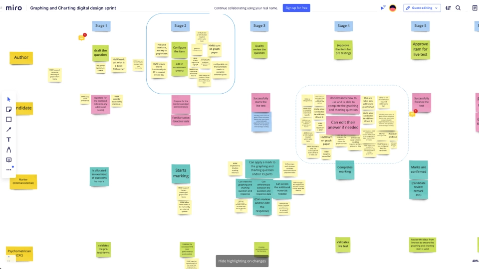
Service Mapping: Zooming Out to See the Whole Journey
To complement the feature-level research, we ran a service mapping session that looked at the end-to-end journey of both authors and candidates. We identified key service touchpoints — where people interact with the product, how support gets triggered, and where different teams are involved.
Mapping how the question item is used across the business.
This helped us uncover two important truths:
Stage 2 of the authoring process is where item authors spend the most time — this needed to be smooth, predictable, and fast.
Stage 4 of the candidate journey (test delivery) was where accessibility and usability mattered most — particularly under exam conditions.
This dual focus ensured we weren’t just designing for function — we were designing for real user contexts.
Technology Review: Evaluating Third-Party Integration vs. Building In-House
We ran a parallel technology review to evaluate existing charting and graphing libraries. Each team member contributed ideas for APIs or tools that could handle the complexity of interactive visual content.
Understanding the technology required to to develop the feature
Accessibility support (e.g. screen reader compatibility, keyboard navigation)
Roadmaps and long-term support
This analysis helped guide the dev team’s architecture decisions, and ultimately led to prototyping with a third-party library (Dresden Chav API), which allowed us to reduce build time while maintaining flexibility.
Authoring Experience: Designing a Clear and Confident Creation Flow
With research and tech validation in place, we turned to the UX and UI of the authoring experience. Our goal was to make graph authoring intuitive — even for users who weren’t especially tech-savvy.
Working through how a user might use the product
We explored different models (freeform vs. guided) and ultimately landed on a wizard-style authoring flow. This approach mirrored the mental model authors already had: working step-by-step to build a question. Key tasks included:
Selecting a graph or chart type
Adding points, lines, shapes, or bars
Editing titles, axes, and labels
Setting correct answers and marking weights
Previewing and saving the question
We reused components from the existing Surpass design system to maintain familiarity. We also layered in instructional hints, tooltips, and inline previews to reduce friction and improve confidence at each step.
Initial design and wireframes
Prototyping and UI Feedback: Collaborative Sketching & Dot Voting
Once the initial UX flows were mapped out, each team member created a sketch of how the graphing tool could live within the existing Surpass interface. We presented, discussed, and voted on the strongest ideas from each concept.
UI design workshop
The final prototype integrated:
A side panel for input and configuration
A live preview of the graph or chart.
Reusable UI elements from other question types
Accessible controls for labels, shapes, and lines
Clear success/error states for feedback and validation
This hands-on prototyping phase gave the dev team a clear direction and reduced the ambiguity that often slows handoff between design and build.
Authoring Experience: Designing for Control, Speed, and Modularity
The team then added more detail to capturing all the functionality for the authoring process.
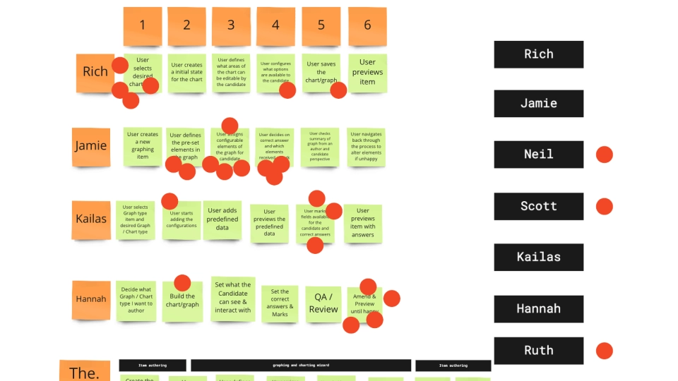
We then did a detailed user journey on how an author would put together a question. We ran a workshop on all the tasks we thought an item author might need to do, and then grouped them in order of how we thought they would do them.
How the authoring part of the feature might work
On some of the key points of this session.
Helped give a clearer guide for the UI and UX.
Captured all functinality needed for the tool.
Tool would be embedded into item offering and the online testing front-end testing viewer.
Split up the graphing tool and the charting tool into separate, independent item questions.
First phase design
Graph Authoring UI/UX: Creating a Confident, Guided Authoring Flow
The graph authoring tool was the most complex piece of this project — requiring a flexible, dynamic UI that still felt simple for authors to use. We designed the experience to support step-by-step creation while maintaining a live preview of the question at every stage.
To do this, we adopted a wizard-style interface that reflected the way authors already approached question creation. This broke the process into manageable chunks, guiding the user through:
Selecting a graph type (e.g. Cartesian, coordinate, curved line, freeform shape)
Adding points, lines, and shapes to the graph
Customising titles, labels, and axes
Setting correct answers and marking weights
Previewing the finished question in real time
We made sure the UI stayed consistent with the Surpass design system by reusing existing components like side panels, toggles, and tooltips — reducing learning curves and streamlining development.
To support both new and experienced users, we included:
Contextual tooltips and hints
Smart defaults (e.g. auto-labeling axes)
Inline validation and warnings to prevent authoring errors
A clear save and preview flow so authors could test before publishing
This approach gave authors full control, while reducing cognitive load and errors — especially for those unfamiliar with technical graphing interfaces.
Tool Settings
Allows item authors to select which tools the candidate can see.
Graph settings
Graph setting configuration by the item author and what the candidate can see.
Point settings
Item author adding points to a graph.
Curve settings
Item author adding a line curve to a graph.
Light lines settings
Item author adding a straight line to a graph.
Shape settings
Item author adding a shape to the graph.
Candidate Experience
Graph Candidate UI/UX: Supporting Interaction and Accessibility Under Exam Conditions
The candidate experience for graph-based questions needed to be powerful but frictionless — allowing students to interact with graph elements confidently during time-pressured assessments.
We mirrored much of the authoring functionality, while locking down system-level controls to preserve test integrity. Candidates could:
Add points, lines, shapes, and labels
Zoom and pan across the graph canvas
Modify labels or axis titles (where allowed by question design)
Use a drag-and-drop interface to position objects precisely
View a real-time visual of their response
Graph settings
The candidate is able to adjust Graph settings to answer a questions.
Plotting points
The candidate can add a point to a graph.
Plotting curves
The candidate can add a curved line to a graph.
Plotting straight lines
The candidate can add a stright line to a graph
Plotting shapes
The candidate can add a shape to a graph
Warning modal
Warning modal if the candidate resets the graph information.
Since the tool was embedded directly into the Surpass test player, performance and accessibility were key.
We designed the interface to work fluidly with:
Keyboard-only navigation
Tab order optimisation for quick access between input fields
Screen reader compatibility to support visually impaired learners
Patterned visuals (e.g. dashed vs. solid lines, filled shapes) to reduce reliance on colour alone
Light UI feedback that confirmed actions (e.g. “Point added”, “Label saved”) without distracting from the test
This careful balance of capability and clarity gave candidates a seamless, equitable experience across device types and abilities.
Graphing tool prototype
We put together a prototype for the developers on how the tool could work, integrating a third-party Dresden Chav API. We are able to show product owners, account holders, and developers how the tools could work. This type of first touch really helps speed up the development of the project. Reduce ambiguity. We were able to share this demo to clients to help show confidence in the product.
Authoring
Bar Chart Authoring UI/UX: Rapid Configuration with Built-In Accessibility
To reduce risk and ship value faster, we made the strategic decision to separate bar chart authoring from graph authoring. This allowed us to build a more focused interface that shared patterns from the graph tool, while simplifying logic under the hood.
The bar chart tool was designed to let authors:
Add up to 10 distinct bars per question
Assign custom heights and values
Reorder bars via drag-and-drop
Add labels and legends with guidance
Choose between horizontal and vertical orientation
Configure axes and gridlines using existing UI panels
We reused core components from the graphing UI — sidebars, wizards, tooltips — but adapted them for a more data-entry-focused workflow.
Accessibility was considered from the start, including:
Pattern-based fills for each bar to support colourblind users
Accessible colour combinations and text contrasts
Clear feedback states for authors when limits were exceeded (e.g. too many bars)
By creating a leaner UI for bar charts, we were able to reduce dev time, simplify QA, and release functionality that was immediately usable for high-volume clients.
Chart tools selection
Item author can select what is the shown on the charting tool.
Chart settings
Configuration allows authors to set an axis and division on the graph, add labels and titles, and to show bar chart values and labels.
Bar Chart configuration
Configuration of the bar chart including:- Chart height, - Label, - Colour, - Order, - Whether it is editable
Chart Key configuration
Configuration of the chat key including bar label & color and whether it is editable or not.
Bar chart on a graph
Item author chart showing all bars plotted on a graphic values, labels and axis labels.
Candidate experience
Bar Chart Candidate UI/UX: Simplified Input, Strong Feedback
For candidates, the bar chart experience needed to be easy to understand, easy to interact with, and completely accessible — especially on timed assessments.
Building on the work done for the graph UI, the bar chart interface allowed candidates to:
Adjust bar heights and positions directly
Add or edit labels for both axes
Add a key/legend if required by the question
Choose between horizontal or vertical orientation (when allowed)
Tab between values or fields for faster keyboard use
Accessibility support included:
Tab navigation between bars and axes
Use of patterns instead of colour to differentiate bars
Fully responsive layout that worked across screen sizes and input devices
Streamlined UI with minimal distractions — helping candidates stay focused and confident during the exam
Bar chart graph
Candidate experience shoing bar chart on a graph.
Bar chart & key
Candidate with accessible bars and chart key.
Key configutation
Candidate can edit the Key to answer a question.
Bar chart label configutation
Candidate can add chart values and bar names to answer a question.
Vertical Bar chart configutation
Vertical bar chart, Candidate can add chart values and bar names.
Accessible bar chart
Accessible version of the bar chart.
Learnings
Outcomes & Learnings: What Worked and What We’d Do Again
Reflecting on the process, there were several things that made this project particularly effective. By taking a collaborative, user-first approach early on — and combining it with structured prototyping and quick decision-making — we were able to move fast without losing quality. These elements helped reduce ambiguity, improve alignment, and deliver something useful and usable within tight constraints.
Running early workshops helped define scope quickly and surface risks
Working closely with technical leads guided our tool selection and development path
Involving support, account managers, and QA early meant fewer surprises later
Reusing Surpass design system components saved time and improved consistency
Sharing a working prototype helped secure internal and client buy-in
No project is without its challenges — and this one offered plenty of opportunities to adapt and improve. These lessons are things I’d carry into future work, especially when building tools that need to balance technical complexity with user simplicity.
Accessibility needs to be designed from day one — not as a final check
Small, scoped item types are faster to develop, test, and improve over time
Real-world exam conditions (like time pressure or device variation) should shape every design decision
Showing — not just telling — your ideas accelerates alignment and trust across teams
Acknowledgements
Big thanks to Kat Owens for her expert facilitation of the early workshops, Richard London for guidance throughout the project, and the wider team — Hannah, Jamie, Chris, Ruth, and Kailas — for their insight into how these item types would be used, supported, and scaled across the platform.